esra günlü kılıç
UX strategy • usability engineering • systems thinking

UX / UI / USABILITY
Vito camera application
Sector :
Company :
Time :
Challenge :
My Work :
Consumer Electronics, Media Entertainment
Vestel Electronics / Venus
6 months
Designing the new-age media capturing application for Venus smartphones with Android OS.
User Research, Ideation, Support on definition of user requirements, Expert review & Usability testing of the previous design, Interaction Design, Layout Design, Prototyping, Preparation of Guidelines for UI and development processes.
Research
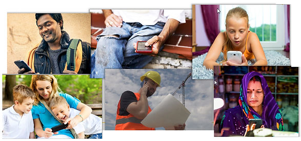
The main focus of this project was creating a usable and enjoyable experience for the targeted user groups of the Venus smartphones. At the beginning of the project, to understand the target user group of the product, some meetings were done with the marketing team, who did already researches on the user groups of Venus smartphones. According to these discussions the user groups were defined to be composed of a wide range of demographic groups with diversified experience levels.
Challenges
The user group of Vito cam app was composed of a wide range of demographic groups with diversified experience levels. To develope an app for this diverge group was a big challenge.
There are wide variety of functions in a camera application of a smart phone. Prioritizing these functions and designing a clear user interface presenting a delightful user experience was the next challenge.
Vestel VENUS smart phones integrating Vito cam app will be presented in whole European market. Acccordingly the user interface elements are fully supported with icons that can be understood universally.
Strategy
As a first strategy, two different user groups were defined according to their technological experience levels; basic user and advanced user, and the information architecture were defined according to this main concept. For users with limited experience with technology, such as the elderly, a “smart mode” was formed that adjusts all settings automatically. On the other hand, an “advanced mode” containing rather advanced settings was defined for advanced users that would like to explore the advanced features themselves.
Additionally, usability tests were conducted with the users and expert reviews executed on the previous camera application of Venus smartphones to define pain points and understand current user experience provided by the product. Depending on these studies, the needs and problems were defined and several design strategies and concepts were developed accordingly.
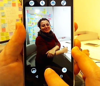
Usability tests of previous design

Solutions
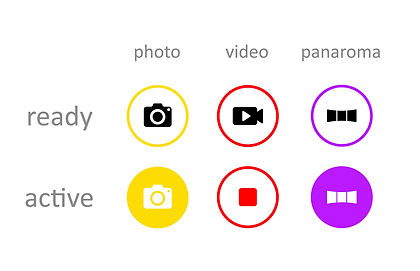
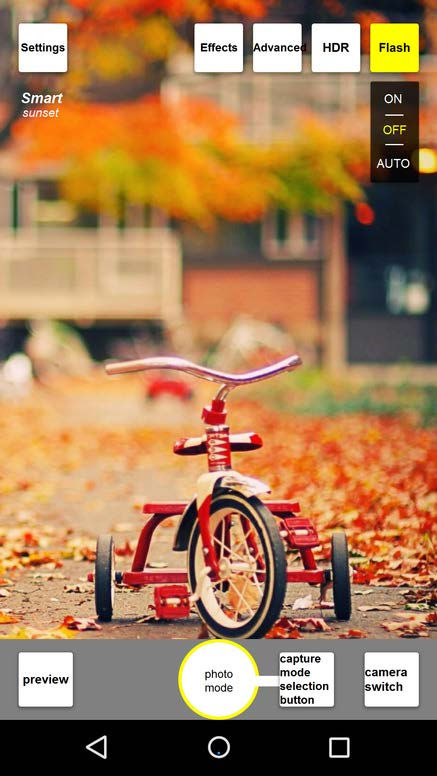
During the early researches and usability tests with previous designs, it was seen there happens a lot of errors while selecting capturing modes (mainly photo-video modes) during the use of camera application. Users can e.g. take videos while actually attempting to take photographs, or vice-versa. This problem occurs mainly because of the similarity of icons and the smallness of smartphone screen sizes. It was defined that this problem is common not merely among the elderly, but also among even more technologically experienced users.
To avoid this a “capture mode” button was created that, when tapped, opens “photo” “video” and “panorama” buttons. It was graphically shown in connection to the shutter button in the middle to indicate their relation. Additionally, besides different icons, shutting button in the middle was also coded through colors changing while switching between modes: Photo-yellow; video-red, panorama-purple to make it easier for users to differentiate between image capturing modes.
Color coding of main shutter buttons
"Capture Mode" button with 3 modes
Exploration for the Capture mode button icon


This provided us also to put panorama capturing mode in a more visible area in the interface of the camera application to motivate users to use it. The reason behind is that, according to our early user studies, it was noted that although being an enjoyable feature for users, panorama capturing mode is mostly not noticed or forgotten by users.
Suitably to the "learnability" principle, there were merely 3 colors, which would be easy to learn after several uses. Through color-coding and intentional two-step capture mode selection concepts, it was aimed to provide users a certain control over using the application while also giving clear feedback about which mode they are in.
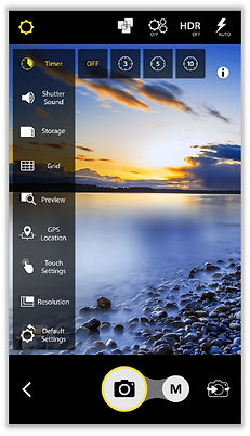
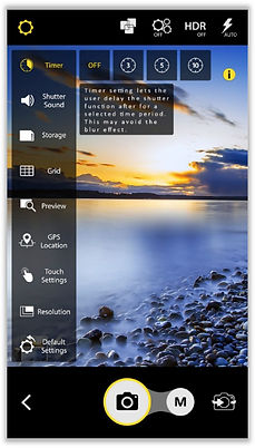
As another common problem especially for basic users was defined was quick reach to help and descriptions of menu elements. We have seen that the most of the camera applications give user guide as a whole document to be searched for, which is mostly out of reach or difficult to explore. In Vito cam app we created small info buttons next to each menu item. Instead of a “help” or “guide” sub-menu that makes mostly very difficult to find the needed info and understand it, specific information windows next to each menu item were created directly available in the context from when tapped to "i" icon.
All these new approaches that we provided were welcomed by users and different stakeholders, which were observed from the user feedbacks after the release.
Prototyping
During the design process, a lot of low-fi prototypes were prepared to test various ideas. These prototypes were used in numerous guerilla testings, discussions and brainstorming sessions with product managers, other designers and development team.
Lo-fi prototype screens


High-fidelity interactive prototype screen samples


Video sampling interactions

Landscape use

