esra günlü kılıç
UX strategy • usability engineering • systems thinking

Unified Mobile communication for Infinity
Sector
Project:
Duration
Business Communication
Native iOS/Android app design for Enreach's Infinity Project / UCaaS
1+ years
Role
Scope
Lead UX Designer
Research, Strategy, and Ideation; Interaction Design and Information Architecture; Layout Design, Wireframes, and Flowcharts; various charts and maps for idea visualisation; Prototyping and Usability Testing; guiding UI Design processes; using and contributing to the Enreach Design System; researching and applying native platform patterns; working in an agile structure by following and improving epics and stories, and providing solutions for backlogs; attending refinements and reviews; aligning with desktop and web teams to ensure consistent solutions across platforms; and defining UX design patterns for inclusion in the Design System.

The Infinity Project was a unification initiative spanning 15+ companies within the Enreach Group. Previously, each company marketed its own standalone product under its own brand. Through Infinity, these product families were unified into a single cohesive suite, paired with a sister initiative that consolidated all brand identities under the single Enreach name. As the lead UX designer, I was responsible for the mobile experience across these unified product families.
The Infinity App itself is a unified communication solution bringing together cloud telephony, chat, and presence features into a single, fully scalable mobile experience. Being cloud-based, it gives users access to their phone system and communication tools from anywhere, on any device, reachable through a single business phone number regardless of device.
Beyond the standard set of features expected from any call app -contacts, call history, voicemail- the product also handled advanced call-center functionality: call queues, pickup groups, hunt groups, call transfer and hold, flexible call forwarding and routing rules, group call handling, HD voice quality, and voicemail with transcription. And beyond call centers, it served as a full communication system for offices and a wide range of other work environments, combining 1:1 and group chat, presence integration with Microsoft Teams alongside manual presence and status management, and contact and favorites management with search and name resolution for unknown numbers.
The broader roadmap also included features such as conference calls, video conferences, public group chats, pinned/marked chats, and more advanced filtering, sorting, and search options—planned beyond the initial MVP scope.

Challenges
The complexity and scale of the Infinity Project surfaced several distinct design challenges throughout the process
-
Mobile-first strategy. As the company had adopted a mobile-first strategy, the desktop web application was designed to follow the structure established by the mobile app, rather than the other way around. This placed a high level of responsibility on the mobile design, as it became the foundation for the entire product. Driven by the inherent challenge of adapting a highly complex product into a constrained mobile screen, the logic was ; if the experience could be made to work on mobile, scaling it up to desktop would be far more straightforward. Because of this, I had to think ahead about the desktop experience while designing for mobile, anticipating how certain decisions would translate later. In some critical cases, I even sketched out the likely desktop version alongside the mobile design, to make sure the two would stay consistent down the line.
-
Parallel MVP and final-product design. The product was too complex to launch in one go, so we started with an MVP. But the final product requirements were already defined, so I had to design the main features of the final product in parallel with the MVP, and consider how the MVP versions can be transferred later to final product. This way, the transition from MVP to final product would be smooth, with no major redesign needed-better for both implementation and usability, since users wouldn't face a completely different product later. Still, working on two scopes at once made the process much harder: I constantly had to track, design, and present both the MVP and non-MVP tracks side by side.
-
Parallel iOS and Android design. As this was a native app, and native design patterns differ significantly between the two platforms, I had to design for iOS and Android simultaneously—producing two separate wireframe sets and redesigning each flow twice, fully aligned with each platform's specific requirements and best practices.
-
Multi-brand flexibility. As the product was offered across 15+ distinct brands within the Enreach Group, each with different feature availability and groupings, the unified experience had to remain flexible enough to accommodate these brand-specific differences without fragmenting the core user experience.
Process and ways of working
As Infinity was a very complex product with a large number of feature sets and challenges, the way of working and collaboration played a crucial role in the process, it was, in itself, part of the overall strategy. Briefly, it worked as follows:
We worked with Confluence and JIRA throughout the process, collaborating closely with the Product Owner, the Product Manager, and the technical team. User requirements were drafted jointly with the PO and broken down into granular JIRA stories, each tagged as MVP or Non-MVP - a structure that directly reflected the MVP/non-MVP duality described above.
As the UX designer, I aligned with the PO on use scenarios and finer details, and contributed to defining the Acceptance Criteria—translating high-level requirements into specific, testable conditions (e.g. filter behaviors, swipe gestures, message states). Beyond translating requirements into design, my work also touched on requirements engineering: while exploring design solutions, I would often surface gaps, ambiguities, or contradictions in the requirements that weren't visible at the writing stage. I flagged these issues and worked iteratively with the PO to resolve them before proceeding.
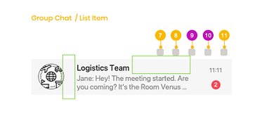
Once requirements were refined and validated, I developed the corresponding design solutions—starting with sketches, then translating them into wireframes for each platform and each scope track. These wireframes were annotated in detail, mapping each UI element back to its underlying requirement (e.g. avatar, status indicator, contact name, timestamp, message preview), and became the primary medium for discussion, feedback, and iteration across the PO, PM, and technical team.
Collaboration in Confluence


User Research
The research phase of the project was conducted in combination with a parallel project focused on developing Enreach's brand identity and brand strategy. As part of this larger initiative, and with some support from an outsourced team, we worked on a broader service design strategy. Within this overall service design flow, the mobile app played a crucial role as the first touchpoint to be realized for end users.
At the outset, we conducted interviews with our customers and end users across different markets and countries. I supported this research by either conducting interviews myself or attending as an observer for those held in Germany. I then transcribed these interviews, reviewed them, and prepared Empathy Maps as the first step in analyzing the gathered data.
Empathy maps prepared after interviews


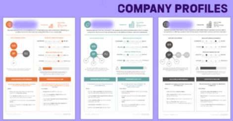
My reviews and empathy maps were used as the data source for the German market. Data from all markets were then combined to define Customer Journey Maps, Personas, and Company Profiles for the whole group. Together with an outsourced research company, we held workshops to consolidate and analyze this data, in order to understand the problems and needs of different user groups, as well as the potential each of our companies could offer. The research data gathered and analyzed during this period went on to inform our subsequent product designs and projects.
User personas and customer journey


One of the biggest challenges in the project was the need to account for different companies, their customers, their markets, and the end users across all of these companies. The research and analysis provided a solid conceptual background, but we also needed to understand the specifics of each company's products and solutions in detail. Because of this, we conducted expert reviews of the current products across the different companies in the group, in order to understand them more thoroughly. Personally, I reviewed several of these products, which also resulted in improvements to the existing solutions, improvements that mattered since these products would remain on the market at least until the Infinity products were released.
Samples from Expert Reviews


At the beginning of the ideation process, I designed a map that I named the Goals-to-Functions Map. My aim was to:
-
Define user goals in interacting with such an application
-
Define the necessary functions that such an application should provide in order to respond to these goals
-
Think through the ways these functions might be delivered to the user
-
Define possible menu groups within such an app, and their relationship to one another across different use cases
-
Provide a map that could support thinking through possible use scenarios
This early ideation map became the main concept map for all mobile and desktop clients. This map listed all possible user goals and related them to possible feature sets. The next step was answering the question of "how?", which guided us in defining the main navigation and information architecture. In light of this earlier exploration, I prepared our product's early flow charts for mobile.
Goal-to-function map

Problem refinement and design strategy
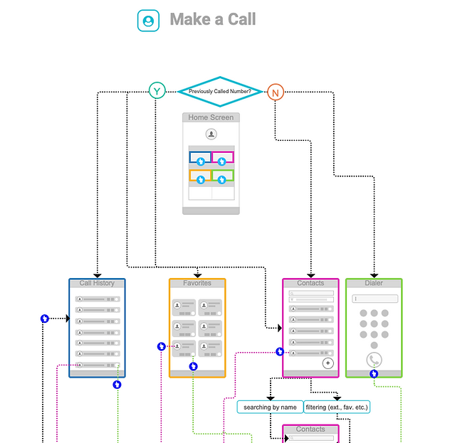
In the goal-to-function map, I was able to define main use scenarios under each function identified, which further revealed the main user flows and needed screens to be designed in the flow. I created the early flowcharts of the main user flows based on these ideation mappings. Through these initial visual maps that I created, we were also able to discuss the high-level navigation structure with other stakeholders.
Early flowcharts


The iterative design process continued in this structure, moving from high-level flows toward the details of each user journey. User stories were written in parallel, and the design followed these stories closely. In this way, the design process supported both the definition of user stories and the creation of solutions for them.
Besides my personal explorations, and sometimes drawing on them directly, we also conducted various workshops, both within the design team and with different stakeholders, to discuss and clarify the detailed product strategy, the details of requirements and solutions.
Workshops with various stakeholders


Ideation for solution
Mostly, after initial hand sketches, I prepared wireframes, supported by additional maps and charts when needed. The user flows in this project were complex enough that my responsibility was limited to the UX design part, and I didn't need to prepare pixel-perfect screens. We also had two UI designers working on the design system, brand identity, and UI details. However, as the main UX designer, I also guided the UI design process by preparing initial visual concepts at the idea level.
Depending on the needs of each user story, my wireframes, user flows, and additional visual guidelines - prepared separately for Android and iOS - provided information and direction for all stages following UX design. In these diagrams, I included:
-
Wireframes showing the high-level layout of each screen
-
Flows for the main user tasks
-
The relationship between each screen
-
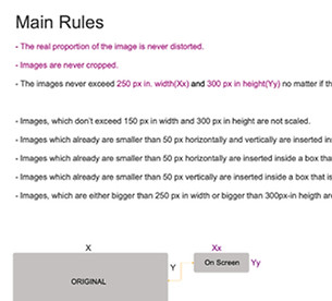
Guidelines on UX behavior at specific screens
-
Expected interaction types for each component (tap, press, scroll, etc.)
-
System feedback given in response to user interactions
-
Native patterns that differ between iOS and Android
-
UI guidelines for visualization
-
Types of components used on each screen
-
Specific notes, such as differences between MVP and final scope, or accessibility guidelines
Profile creation - Flow diagram for iOS
Profile creation - Flow diagram for Android


Defining UX behaviour


Various UX flows and guidelines shaped according to the need of the story



Guiding Interactions and UI design


After high-level discussions and refinement, I started with exploring the solution space. As I usually do in any design process, I started my initial explorations with sketches and additional smaller ideation maps.
Sample sketches


Design system and UI design
As mentioned earlier, I was the UX designer on the project, but I also guided the UI process to ensure a consistent UX-to-UI transition. We had a team working on UI and the design system, and I remained in close, continuous contact with them throughout the entire process, end-to-end. Component designs followed UX decisions, while in turn, UI and implementation constraints often fed back into the UX design process. For each user story, the UX design was directly followed by UI design screens, which were then handed over to the development team. The details of these screens were refined later, as new constraints emerged from subsequent user stories, ensuring consistency across screens and adherence to the design system.
Design system


UI screen samples


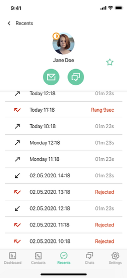

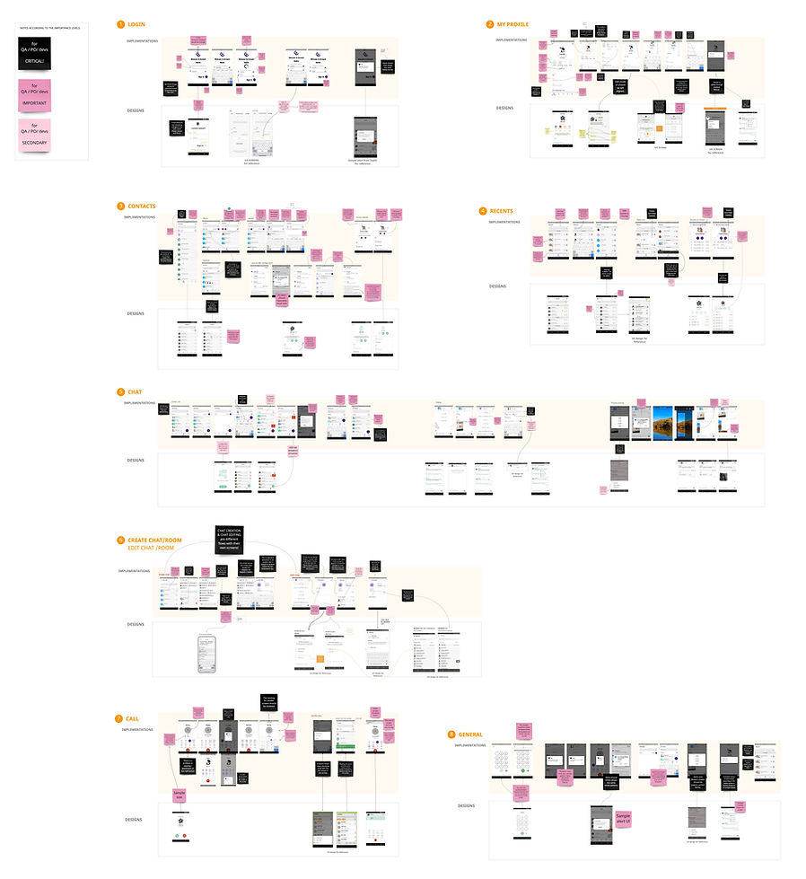
As the end-to-end UX designer, my responsibility didn't end after handover. Following the iterative agile process, I also reviewed the implementation screens and provided visual review reports to further guide the development teams in improving the UI and adhering to the UX guidelines. Throughout this process, I also supported the iOS and Android teams separately.
Implementation review

Taking on an important role in one of the most significant projects at one of the largest companies in business communication, and solving complex problems while working across several teams simultaneously in an agile structure, was a challenging but truly invaluable professional and personal experience for me.