esra günlü kılıç
UX strategy • usability engineering • systems thinking

RTApp for hearing aids
Sector
Project:
Duration
Medical Technology
Multi-Brand Hearing Aid Control Platform (20+ Brands)
1,5 years

Role
Scope
UX & UI Design Lead
Redesigned a legacy mobile application for remote hearing aid control and tele-audiology services across 20+ hearing aid brands worldwide.
Owned the end-to-end mobile product design strategy and execution for WSA’s multi-brand hearing aid ecosystem. Led the complete UX process from research to delivery, established a scalable design system supporting 20+ brands, aligned cross-functional stakeholders, and enabled consistent implementation across five development teams while ensuring compliance with medical device requirements.

Project Brief
Designing a Companion Experience for the Hearing Journey
RTApp is a companion mobile application for hearing aids developed by WS Audiology, supporting over 20 brands across more than 30 countries. The app is designed to guide users throughout their hearing journey, helping them adapt to hearing aids, stay engaged, and continuously optimize their hearing experience. Through RTApp, users can connect to and control their hearing aids, personalize their sound settings using AI-supported features. The product operates at the intersection of healthcare, consumer technology, and accessibility, where usability directly impacts daily quality of life.
At the start, stakeholders framed the request as a UI update, mainly to modernize the look and feel. Considering the outdated visual style of existing RTApp and its unconsistency to high-end WSA hearing aids as a companion app, this perspective was valid. However, early research and analysis showed that the issue went beyond visual identity and required a broader reframing toward improving the overall user experience. As a result, the initial project brief from marketing and management was challenged by UX design, and the problem was redefined at the beginning of the design process.
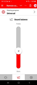
Former RTApp design




Early Research & Insights
The initial reasearch for problem definition was grounded in a combination of quantitative and qualitative research and analysis of them
-
In-app feedback and app store reviews
-
Analysis of usability tests on the existing product
-
Expert interviews with hearing care professionals who are in direct contact with users during their whole hearing aids wearing journey
-
Feedback from WSA marketing teams across multiple global markets and brands
-
App usage analytics and behavioural data
These inputs were synthesised to answer three critical questions:
-
Which features do users truly value?
-
How do users perceive the app as a companion to high-end hearing aids?
-
Where exactly do users struggle in their journey?
Key insight:
Users appreciated the capabilities of the app, but failed to fully benefit from them due to poor discoverability and interaction clarity.
Initial research data from different resources


Reframing the Problem
High Value Features. Poor Usability Experience
RTApp already offered strong, value-adding features aligned with real user needs. However, the overall user experience did not reflect this value.
Over time, new features had been added without a clear structural relationship to existing ones. This resulted in a fragmented interface where users struggled with mainly finding and reaching key features and understanding what features do and when to use them.
These issues were especially critical given the primary user group, as a significant portion of users were 60+, often with varying levels of digital literacy and accessibility needs.
According to our investigation, we identified that the main issues were concentrated in the home screen (named as 'remote control' screen in former design processes), where the core functionalities and interactions take place. Based on this, we defined the key problem areas as follows:
-
Poor findability of features
-
Poor discoverability and learnability for new features
-
Accessibility issues
-
Unclear and inconsistent labeling
-
Layout and placement problems
-
Issues in UX writing
-
Inconsistent unclear icons and visual elements
-
Outdated visual identity and presentation

After identifying the problems in the current design, stakeholder workshops were conducted to communicate the full scope of the problem space, highlighting the need for a broader UX redesign rather than a visual UI update. As a result, management, technical, and marketing teams aligned on this direction, and the problem space was reframed accordingly.
Project Constraints
From the beginning of the project, several constraints significantly affected the solution space.
The redesign was expected to improve usability without rebuilding the product from scratch. Key constraints included:
-
The same code base had to be maintained, requiring close collaboration with development teams
-
The existing navigation structure had to be largely preserved
-
A design system was needed to support over 20 brands with different brand identities and hundreds of hearing aid models with varying feature sets
-
The multi-brand setup resulted in a large number of stakeholders across different brands and markets, in addition to typical design stakeholders
-
Limited time and resources
Target Users
The primary target users are hearing aid users across different age groups and markets, with a strong focus on older adults (60+) who may have lower digital literacy and higher accessibility needs. They use the app daily to manage and adjust their hearing experience, requiring clear, simple, and low-effort interactions. At the same time, the product must also support more tech-savvy users who expect efficient and flexible control. The design balances simplicity, accessibility, and functionality across multiple brands and devices. Additionally, hearing aids are often associated with aging, creating a stigma that can negatively impact adoption and user confidence. The mobile app plays a key role in breaking this perception by positioning hearing aids as modern, empowering, and seamlessly integrated into everyday life.


User profiles


According to research conducted by WSA's marketing team, five main user profiles were identified. The largest group was the one most affected by the stigma mentioned above, so addressing their needs was identified as critical. At the same time, there were common behaviours across multiple user profiles: their relationship with technology was generally not very strong, and they had several cognitive and perceptual needs. They were also not easy to persuade into using or adapting to hearing aids, for a variety of reasons. These takeaways gave clear direction for how the RTApp should be redesigned. The goal was to create a UI that was both a novel design with better usability but not requiring high-cognitive effort to learn. The initial concept, grounded in this research, kept the core elements of the existing design and aimed to create an experience that wouldn't overwhelm existing users with a completely new learning pattern.
This approach first required identifying the essence of the existing design in order to follow a similar direction, while still resolving the additional usability and adaptability issues.
Design Ideation
After aligning with stakeholders on a broader solution space, initial ideation focused on layout design, identified as the key element to address the defined usability problems.
Analysis showed that the previous RTApp layout followed a remote-control concept, where all key features were placed directly on the home screen. However, features appeared randomly positioned, and new ones were added without considering their relationships to existing elements. This resulted in visual clutter and confusion, identified as a major cause of usability issues.
The first step was to analyze all visual elements that needed to remain on the home screen. With over 20 brands and numerous hearing aid models supporting different feature sets, the layout needed to accommodate a wide range of feature combinations.
At the same time, each brand had its own identity and configuration. The layout therefore needed to be flexible enough to support multiple feature variations while maintaining a clear, consistent, and high-quality visual structure.
All visual elements were systematically listed and analyzed. Some of these elements were also present in other screens, so their role and necessity across the overall flow were evaluated. This helped define a clear hierarchy of information and determine which elements should be prioritized on the home screen.
In addition, relationships between elements were examined. Elements that needed to appear together, those providing related or sequential information, and those functioning independently were identified. This analysis informed a more structured and coherent layout strategy.
Analysis of the required visual elements on the home screen


Design strategy
Through initial iterative ideation and exploration, a solution was developed addressing technical, visual, marketing and usability requirements. Following early sketches and brainstorming sessions, a design strategy was prepared and presented in large-scale workshop meetings with a wide range of stakeholders and domain experts. The concept was well received, and extensive feedback was gathered.
The core strategy was to introduce a new layout in which functionalities were grouped and differentiated according to their relationships.
A key consideration was the cognitive and visual capabilities of the target users, many of whom are older adults. Therefore, the redesign aimed to improve usability without creating a disruptive or unfamiliar experience that would require significant relearning. At the same time, technical constraints such as maintaining the existing code base and overall information architecture required a careful balance between continuity and novelty.
First sketches exploring layout design

According to the initial explorations in low-fidelity, they were presented to various stakeholders. The main design concept included:
-
Introducing a customizable area at the top of the screen for independent elements that vary by brand and device
-
Separating the main interaction area from the background using a card structure, enabling clearer functional grouping
-
Repositioning the program type card below and grouping it with the main functional area, reflecting its dependency on the selected program
-
Differentiating the visual backgrounds of sliders across different screens helps users map each slider to its corresponding feature, improving recognition and reducing mismatches between screens and features
-
Moving the level indicator above the slider knob to ensure visibility during interaction, previously obscured by the user’s finger
-
Introducing a wave-based animation inspired by sound waves, providing clearer visual feedback during interaction and applying a different version of it to different sliders on other screens to support identification.
-
Adding clear and understandable labels to interactive elements to improve usability and comprehension

Design concept
UI Exploration
In the next steps, feedback was gathered from a variety of stakeholders. The design was explored through low- and high-fidelity screens, enabling continuous iteration and feedback. All main app screens covering the core features were designed based on the main concept.
Later, a high-fidelity, fully interactive prototype was created in Axure. Preparation for a usability test was conducted to gather user feedback on the concept.

Initial UI concepts for main screens

Interactive prototyping in Axure with micro interactions and animations

Usability tests
We conducted an in-person usability study with six hearing aid users using an interactive prototype. Four participants were existing RTApp users, while two had no prior experience with the application. This allowed us to evaluate the redesigned experience both against existing user expectations and the learnability of the interface for first-time users.
Objective and setup
The objective of the study was to validate the usability and first impressions of a redesigned Signia hearing aid companion app prior to implementation, with a focus on the updated visual design, information architecture, navigation, and discoverability of key features.
-
The research was conducted as moderated in-person usability testing in Germany on both Android and iOS devices with participants aged 35–70.
-
The study was run by a team of three researchers and designers, and participants were end users from Germany.
-
The study combined an initial interview, first-impression assessment, task-based usability testing, and a UEQ (User Experience Questionnaire).
-
The evaluation covered volume control and left/right decoupling, directional hearing, balance and Mask Mode, program switching, battery status, eHealth features, the Signia Assistant, as well as overall navigation and information architecture.


Test results and overall task performance
All tasks achieved high success rates, with overall completion above 80% and most core flows reaching 100% (6/6 users). Key functions such as volume control, directional hearing, mask mode, battery status, and the Signia Assistant were consistently easy to find and use. The redesign was strongly positively received, described as clear, modern, younger, and pleasant, supported by improved icon size and stronger visual hierarchy.
Usability test data and results

Word cloud of the test


Besides usability tests, UEQ results also indicated an overall positive user experience, with above-average scores across attractiveness, clarity, efficiency, and controllability, showing a generally well-received and easy-to-use interface. Considering the older user group, the design achieved a balanced level of modernity, appearing attractive and updated without becoming unfamiliar or confusing, which supported ease of adoption.
User Experience Questionary


Opportunities for enhancement
Core feature access and usage were generally high, but we also identified key refinement opportunities for future iterations. Navigation was overall understandable, with room for simplification in the home screen UI, while background wave visuals could have been further reduced to create a cleaner experience. Program switching needed to be made more prominent through a clearer and more visible program card, which would have improved discoverability at key moments. Terminology and feature labels (e.g., Health, Directional Hearing, Sharp/Soft, Mask Mode) were not always immediately self-explanatory and would have benefited from clearer wording or added guidance, and external factors such as Bluetooth connectivity issues had a notable impact on overall trust in the experience.
Refinement of the design based on the feedback
The results of the usability tests were promising. The new design was well received and significantly improved the initial problem areas. However, we also identified several usability and desirability issues that required further refinement. Based on feedback gathered from users and various stakeholders, the design was further improved and fine-tuned.
Final design as Signia brand


Dark mode in Rexton brand style


Samples from different brand styles


Design Implementation Process
The implementation of the new design took approximately nine months and was carried out in close collaboration with the development team. Design files and guidelines were shared incrementally, allowing feedback to be gathered throughout the implementation process. Each phase was reviewed upon completion, and detailed feedback was provided before moving on to the next stage. Insights and technical constraints identified during earlier phases informed refinements to subsequent designs. This iterative approach enabled early validation, reduced implementation risks, and ensured efficient collaboration between design and development teams.
Design system, multi branded UI strategy and localisation
To support the implementation process, a comprehensive design system was created. The overall strategy was to maximize the use of shared components across both iOS and Android platforms, ensuring consistency while reducing development effort. However, critical system components were kept native to each platform to provide a familiar and intuitive user experience. This was particularly important because the primary target group consisted of hearing aid users aged 60 and above, who generally benefit from interaction patterns already familiar from their smartphones.
The design system was built to support multiple brands and product variations. UI specifications, component behaviors, and design guidelines were carefully defined to enable efficient implementation and maintenance across a large portfolio of branded applications.
At the beginning of the project, Sketch was the company's primary design tool, and the initial component library was created in Sketch. Following the organization's transition to Figma, the entire design system was recreated and further developed in Figma to support future product development.
Sample components from the design library


Besides the existence of specific feature sets, the reflection of brand identity was mainly provided by use of UI elements such as, color, elevation, icons and illustrations. Additionally, the branded copy and tone of voice were also utilised in various parts of the application. This process was conducted closely with a variety of different brand management teams and development teams.
The needs of localisation has also been considered during the implementation. The translation of critical labels and concepts by localisation team were guided and followed by me. The standards of localisation were defined according to the native patterns and needs of specific markets. For example, the bigger markets were prioritised for detailed localisation in collaboration with marketing teams considering the time and budget resources.
In the market
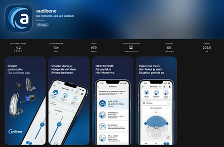
With its scalable and user-centered design, the app has been available on the Apple App Store and Google Play since 2024. It supports more than 20 brands, each with a unique combination of features and configurations. Distributed globally across EMEA, APAC, LATAM, and North America, the app serves millions of users and is localized in over 30 languages.
App in stores



Celebrating the success
Shortly before the product release, we submitted the redesigned RT App to the prestigious UX Design Awards. As with the overall product redesign and implementation process, I led the preparation and submission of the award application. Together with our Graphic Designer, Christian, and UX Writer, Vlada, we developed the submission materials and represented WS Audiology in the competition.
The project was selected as one of only six winners in the Product category among more than 500 international submissions from leading companies worldwide. The award recognized not only the quality of the final user experience but also the successful transformation of a complex, multi-brand hearing aid ecosystem into a modern and accessible digital product.
UX Design Award

